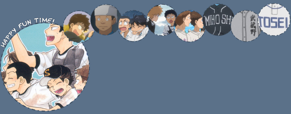
:: MIHOSHI FASHIONS
As a bonus, allow me to review the other major teams' uniforms as well! I mean, since I'm already making a stupid page about fashions, I have nothing to lose.
Welcome, ladies and gentlemen, to wonderfully colorful world of MIHOSHI! In case you haven't noticed, this jolly angry mob of a team has a uniform for every occasion, and there was even an entire bonus page about it in the Ookiku Furikabutte comic. Oh wow! Mihoshi is truly the most fashionable team out there!
THE CAP
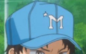 Strangely enough, no matter what uniform the people of Mihoshi are wearing, the traditional baseball cap remains the same! It's a lovely light blue color, and a bright white M brightens up the front. On the top right corner above said M, is a mysterious star of unknown origins! I'm thinking that maybe when all the baseball uniforms were inspected by the baseball uniform inspecting people, said people were so awed by Mihoshi's incredible fashion sense that they gave them the star.
THE CATCHER HELMET
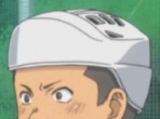 The catcher helmet is WHITE! How often do you see a WHITE catcher helmet? Hatake obviously wanted to stand out from the other plain old catchers out there. That's the spirit, Hatake!
THE BATTER HELMET
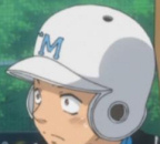 Now THIS is a sight to behold! The batter helmet is white like the catcher version, and compliments the baseball cap SO very nicely because as you can see by comparing the two headgears, the colors are inverted! How brilliant!
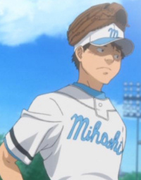
THE PRACTICE MATCH UNIFORM
 Usually featured on merchandise and in flashbacks, this is the uniform most people associate Mihoshi with - probably because they were seen wearing it for several episodes, while the other uniforms only got a few seconds to shine. This uniform is VERY special because the shirt and pants are different colors! GASP, leave it to Mihoshi to try out something as outrageous as that and succeeding in making it look awesome.
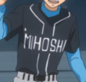
THE OFFICIAL MATCH UNIFORM
 Although you can't see it very well in this picture, the Mihoshi logo on this uniform is the same as the one on the practice match uniform, only blue instead of white. The uniform itself is very bright and pretty, and it even has these fantastic red stripes! The back numbers are also red.
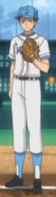
THE RANDOM PRACTICE UNIFORM
 As demonstrated by everyone's favorite psychotic battery, Mihoshi's random practice uniform is plain and white and the same as Nishiura's, actually - they're just using that lovely light blue undershirt instead of the boring old black one. Hooray!
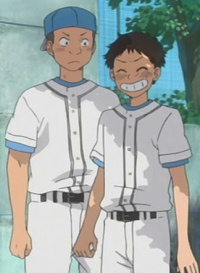
THE MIDDLE SCHOOL UNIFORM
 Riiight so uhh... I'm a tiny bit reluctant to write about this because of the dreaded cursive writing, but hey, middle schoolers are silly, so it's all forgiven! Besides, this is MIHOSHI we're talking about, and they obviously know much more about fashion than I do, so I have no room to talk. So let's get to the point - Mihoshi's middle school uniform is very bright and makes me happy just looking at it! I guess they needed something bright and cheerful to counter the fact that their team sucked so bad back then. The cap is REALLY cool because the visor is a different color! How stylish! Instead of the red back numbers of the high school uniform, the middle school version went with plain ol' black.
By the way, I don't think it's a time-old Mihoshi tradition to wear your glove on top of your cap like that. Yoshi probably just felt like being silly. Or MAYBE he's making a fashion statement.
NISHIURA
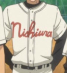 Yeah so to be honest, Nishiura has my second least favorite team uniform on the show. Oh well, whatcha gonna do! While that creamy off-white color is kind of icky, the Nishiura logo is what bothers me the most. It's that darn cursive font! It's ANNOYING!
 Nishiura's cap is a-ok though! I like it, although it doesn't make sense for the logo to be yellow because there's nothing yellow anywhere else on their uniforms. I'm guessing the UN is for Nishi Ura, although why the U is before the N is beyond me! Maybe it's some kind of crazy fashion statement, much like Dosei's ridiculous cap logo.
TOSEI
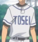 Now Tosei's uniform I LIKE! The light, nearly white blue color is very easy on the eyes, and the font logo is all bold and intimidating and NOT CURSIVE. Like this very website's layout suggests, I'm very fond of the blue and white combination. You can never go wrong with it!
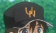
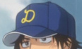 Tosei's hat... gives me chucks. Even though the logo is apparently supposed to be a weird T and S hybrid, we all know that's a load of bunk and it's ACTUALLY a D. Why is it a D, you ask? Beats me!
MUSASHINO
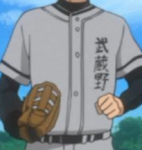 I like Musashino's uniform a LOT! Gray is actually one of my favorite colors (or shades, whatever), and Musashino manages to pull it off WONDERFULLY! It just looks really cool, tidy and professional. The team name is written in kanji, which is fine with me - in fact, it looks really cool to have the logo vertically on one side like that! Wow Musashino, you sure are fashionable!
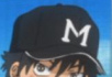 Musashino's hat is exactly the same as Mihoshi's except a different color and without the star. Also, the Ms are SLIGHTLY different, but it's hardly noticeable. Say... it all makes sense now! The Musashino guys obviously WISH they were as incredibly fashionable as Mihoshi. I mean, while Musashino are fashionable and all, no one beats Mihoshi in that department. Nice try, though!
TODAKITA
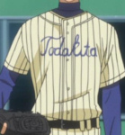 It IS Todakita, right? Can't be too sure with the CURSIVE FONT and all (imagine me saying 'cursive font' while snorting and snarling all angry-like). You may remember me saying Nishiura's uniform is my second least favorite a few moments ago. Can you guess which my number one least favorite is? It's THIS monstrosity! Come on, LOOK at it! What's with the HORRIBLE stripes? It looks like a pair of pajamas more than anything! This truly is a travesty of baseball uniforms. The logo text also has really thin lines, so it kind of blends in with the gruesome stripes.
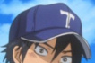 The cap is okay though. I really have nothing to say about it. It sure is a baseball cap!
KASUKABE
You know, Kasukabe! The totally random team that never really did anything, yet got all these random spotlight moments for no reason! WHAT is up with that?
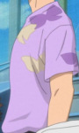 GREAT BOUNCING ICEBERGS!! Is THIS purple thing with the yellow and dark purple butterflies seriously Kasukabe's undershirt?!
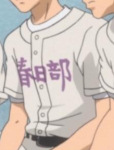 Oh wait, wait, wait, false alarm! It appears as though the thing above is just something Aoi happened to be wearing and that THIS is their uniform! It sure is... white! Seriously, EVERYTHING on this uniform is white except the text logo. Which is purple. And written in kanji, although it's horizonal and therefore not as rad as Musashino's.
 The cap is also white, imagine that! It has a bold purple K on it.
SAKITAMA
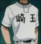 My love for Sakitama burns with the power of a thousand blazing suns, but all bias aside, their uniform is actually pretty mediocre. There's nothing WRONG with it, but there's nothing particularly amazing about it either. It's just black... and white... and horizonal. I do like it, though. It's neat. Sakitama remain modest and aren't trying to be flashy and outrageous, and I support their choice whole heartedly!
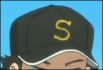 Sakitama's cap kind of looks like Nishiura's except with only one letter. It's also a million times more awesome since Sakitama has a reason for their logo to be yellow! It matches the yellow stripe on their socks, you see. Aaand yellow is the best color ever much like Sakitama is the best TEAM ever!
BIJO
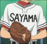 Bijo's shirt logo is really dumb because it says 'Sayama' and it's not like anyone ever calls them Sayama EVER. Other than that, I quite like Bijo's uniform. It's simple and neat, and that particular shade of red they use for certain parts of it is just DASHING! They're obviously trying a bit TOO hard to be flashy and outrageous like Mihoshi, though, with their little stripes and the whole ridiculous 'Sayama' thing. Not cool.
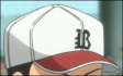 To make the fact that their shirt says 'Sayama' even DUMBER, their caps have Bs on them which stand for Bijo. This is only stupid because it totally contradicts what their shirts say. MAKE UP YOUR MINDS, BIJO!! Do you want to be Bijo or Sayama? Can't have TWO names, you know! Except that they totally can, apparently.
OTHER THAN THAT, the B stands out because it's written in an olde English typeface. I'm... not sure whether I like it or not. I either hate olde English, or I love it. I can't decide!!
...But seriously, enough about the other teams! You'd better get back to marveling at Mihoshi's greatness before they decide to form an angry mob and kick you off the team.